By Gordon Rugg
This article is a re-blog of part of a previous article about assessing whether or not you’ve met a client’s goals in a product design.
I’ve re-blogged it to form a free-standing article, for anyone interested in systematic approaches to recording and analysing people’s activities. I’ve lightly edited it for clarity.
The examples I’ve used below relate to product evaluation, but the same principles can be applied to other human activities, such as how people make decisions when shopping, or how people find their way around in an unfamiliar place.
Activities, tasks, and usability
There are various ways of measuring how easy it is to use a product. Some common measures are:
- Time taken to perform a given task
- Number of separate actions required to perform a task
- Number of times a user makes a mistake when performing a given task
- Number of times a user hesitates or goes to the help pages
- Number of times a user mutters or swears
- Number of times a user smiles or says something positive
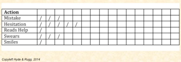
It can be useful to have a tally sheet for recording how often each of these things happen. Other useful aids include a timeline sheet and Therblig-style notations.
Tally sheets
A tally sheet is for recording how often each thing happens. It can take various forms – we advise using whatever works best for you.
Here’s an example.
Timelines
A timeline sheet is different from a tally sheet in that it records the sequence in which actions occur. There are various ways of doing this; for instance, each column might just represent the next activity, regardless of how long each activity lasts, or each column might instead represent a specified length of time, such as five seconds. Timeline sheets can be useful for spotting patterns and sequences of activities.
Here’s an example.
This timeline tells a story that would be missed by a tally sheet.
The user has begun by reading the screen (first column), but they’ve then hesitated (second column), which tells you that maybe the on-screen text isn’t easy enough to understand.
Next, they click on an option and they input text, followed by swearing, which suggests that the software didn’t do what they were expecting. They hesitate, read what’s on the screen, and then go to the Help option. This tells you that the text on screen didn’t give them the information they needed; you’ll need to fix that. After reading the Help option, they swear again. This is telling you a clear, vivid story about what’s going wrong, and what needs to be fixed in the next version.
Hint: When you’re trying to keep track of how long someone is spending on each activity, it’s usually not practical to use a watch or a mobile phone to measure the time, because you’re having to look at too many things at once. It’s usually much easier to count the seconds in your head as “One second, two seconds, three seconds” etc.
Another hint: Swearing is your friend. It tells you where significant problems are occurring, that you need to fix. A surprising number of people don’t transcribe swearwords when they’re recording sessions like the one above, on the grounds that “swearwords are rude”. This is a major mistake, because swearwords are one of the best indicators of where problems are occurring.
Timelines overlap with Therbligs, which are a well-established notation for activities.
Therbligs
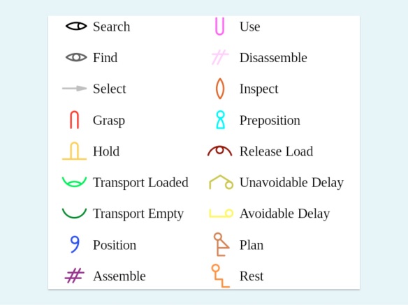
Therbligs were originally devised as a pictographic notation for recording sequences of physical actions in manual tasks, such as assembly-line work in factories. There’s a core set of commonly used notations for activities such as “pick up” and “visually inspect” which are shown below.
There’s an explicit expectation in this approach that you’ll need to add some new notations to fit whatever topic you’re working on, such as a notation for “press Return key” or “press back arrow” if you’re using this approach to record what people do when using some new software.
https://en.wikipedia.org/wiki/File:Therblig_%28English%29.svg
Therbligs have been around for a long time, and they’re still useful today.
In a later article, I’ll go into more depth about Likert-style scales and questionnaires.
Notes and links
You’re welcome to use Hyde & Rugg copyleft images for any non-commercial purpose, including lectures, provided that you state that they’re copyleft Hyde & Rugg.
There’s more about the underlying theory in my latest book, Blind Spot, by Gordon Rugg with Joseph D’Agnese:
http://www.amazon.co.uk/Blind-Spot-Gordon-Rugg/dp/0062097903
There’s more about data collection methods in my book with Marian Petre, A Gentle Guide to Research Methods:
Rugg & Petre, A Gentle Guide to Research Methods:
http://www.amazon.com/A-Gentle-Guide-Research-Methods/dp/0335219276
There’s a reasonable Wikipedia article about Therbligs here:
https://en.wikipedia.org/wiki/Therblig


Pingback: The Knowledge Modelling Book | hyde and rugg
Pingback: People in architectural drawings, part 5; common requirements | hyde and rugg
Pingback: Observation, stumbles and smiles | hyde and rugg
Pingback: Visualising complexity | hyde and rugg