By Gordon Rugg
There are a lot of regularities in how human beings use space. If you know what those regularities are, then you can make it much easier and more pleasant for people to use a space, whether it’s a shop or a workplace or a public building.
This article describes some useful concepts relating to this topic.
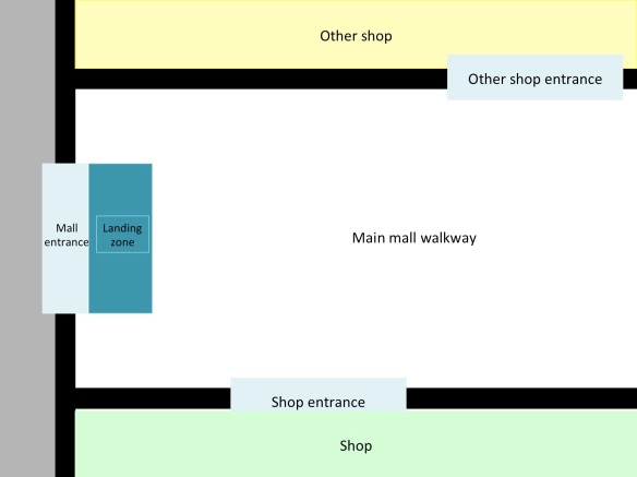
The image below shows a schematic plan of the entrance to a shopping mall. The street outside is grey; the main entrance is broad enough for two people to pass through at the same time; there’s a shop at the bottom of the image, shown in pale green, and another shop at the top of the image, shown in pale yellow. The entrances to the two shops are not directly opposite each other.
So what happens when people use this space?
The next image shows something so commonplace that most people don’t think about it as a predictable feature of a design. It’s what Paco Underhill calls the landing zone. When you enter a building, particularly one where you’re coming in from the open air, you’ll often want to pause and sort yourself out before going further inside. “Sort yourself out” includes things like folding your umbrella or taking off your hat, if it’s been raining outside, and things like getting out your shopping list.
If other things are equal, the landing zone will be just inside the entrance. The problem is that this location results in some people moving slowly, or not moving at all, in a space that other people want to walk through because it’s on the flight path to somewhere else. That’s a recipe for collisions, delays and hassles, which don’t help the customer’s attitude towards the mall.
The image below shows the flight path from the main entrance to the first shop. The normal landing zone for the main entrance almost completely covers this flight path. However, there’s a side-effect of this flight path which means that there is no longer a problem with a landing zone just inside the main entrance.
The flight path to the first shop goes from the main mall entrance to the shop entrance. It’s not perfectly straight – people are likely to aim for the centre of the shop entrance initially, and then some of them on the right side of the flightpath will dogleg slightly at the last moment towards the right.
Because the shop entrance is some way inside the mall, there’s a triangular area of space that’s off the flight path. The image below shows this space in green.
This type of space can be described in various ways. I’ve called it a still zone. It’s an area which is not crossed by any direct flight paths between destinations. As a result, it’s usually a quiet place, in terms of traffic.
In this example, the still zone is in a good location for acting as a landing zone – it’s adjacent to the entrance, and it’s big enough to accommodate a wet shopper comfortably. The blue oval labelled “S” shows a shopper is moving from the flight path to the still zone, which they’re going to use as a landing zone.
Once you spot regularities like this, you can start factoring them into your design. For instance, you might decide to design in a still zone that’s big enough to accommodate a parent with a pushchair, in which case you need to check how big that space needs to be. It’s not rocket science, but it can remove a lot of hassles, not only for the parent, but also for anyone who would otherwise have been held up behind them, waiting to get properly inside out of the rain.
Human behaviour
Once you start looking for regularities in how people use space, you start seeing a lot of things that most people look right past without noticing. Here’s an example. It’s the Lurking Partner, shown by the red oval labelled “LP”. A common type is the male partner, waiting outside the female clothes shop, while the female partner shops inside.
Note how the LP is on the flight path for the blue customer, if they want to move from the still zone to Shop1. They are also disrupting the main flight path into the first shop.
There are ways of reducing this problem, such as putting a couple of large potted plants outside the shop entrances, so that there’s a still zone beside each plant where the LP can wait. As is often the case, the solution isn’t particularly difficult when you have the mental tools for structuring the problem.
The next illustration shows the other still zone, on the far side of the mall entrance, and shows how the main mall walkway is full of overlapping flight paths, which are a recipe for hassles and collisions.
What happens if there’s an obstacle, such as a big rectangular planter in the middle of the main walkway? Answer: you get a still zone each side of it, like this. The obstacle is the brown rectangle labelled “O”. For clarity, I’ve only shown foot traffic coming inward from the main mall entrance; we see a more realistic image later.
These still zones are a different type of still zone. They aren’t as still or as sharply edged as the first two we saw, because they’re in the way of varying amounts of traffic from various directions. In formal terms, they’re fuzzy, rather than crisp. Some parts of each still zone will quite often be crossed by pedestrian traffic; other parts will only rarely be crossed by pedestrian traffic.
The figure below shows how the traffic between the two shops cuts across still zone 3, but doesn’t cut across still zone 4, so the two zones won’t be the same size and shape; still zone 3 will be smaller and flatter and less still than still zone 4.
A real-life example
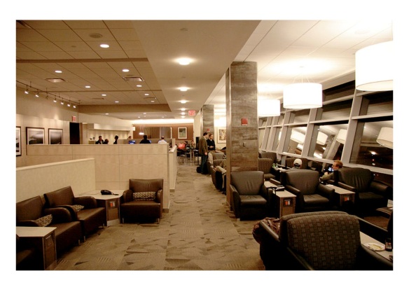
The image below shows the American Airlines Admirals Club lounge. It’s a good example of how you can create still spaces by skilful use of flight paths and blocking features, which are features that make it difficult or impossible for users to do some activity that the designer wants to prevent.
https://commons.wikimedia.org/wiki/File:American_Airlines.Admirals_Club.2007.jpg
In this example, the seating is to the side of the flight path to the far end of the room, and all the seating is arranged so that the customer’s feet don’t protrude into the flight path. The edited version of the image shown below indicates some key features of this design, in terms of pedestrian traffic.
The partition is an example of a blocking feature that makes it difficult for customers to do something, but doesn’t prevent them completely. In this case, the blocking feature makes it inconvenient for customers to take any route other than the intended flight path from one end of the room to the other, but doesn’t make it completely impossible. The pillar, on the other hand, makes it impossible for anyone to use a route going through that particular point.
This is often a useful distinction when you’re dealing with safety-related issues. If there was a fire, for instance, a blocking feature that makes a route impossible might be a death trap, whereas a blocking feature that could be easily climbed over or pushed aside might mean lives saved.
That’s a brief overview of some useful concepts relating to how people use space. In a later article, I’ll discuss some ways of finding out how people actually behave in assorted spaces and situations.


Pingback: STROBE: STRuctured OBservation of the Environment | hyde and rugg
Pingback: Signage, literacy and wayfinding, part 1 | hyde and rugg
Pingback: People in architectural drawings, part 3; requirements, obsolescence and fashions | hyde and rugg
Pingback: People in architectural drawings, part 5; common requirements | hyde and rugg