By Gordon Rugg
Design is a subject that tends to provoke strong emotions.
It’s also a subject where people tend to have opinions that appear deeply conflicting.
This article looks at why this situation arises, and at how we can move beyond it.

https://commons.wikimedia.org/wiki/File:Bambouseraie_de_Prafrance_20100904_110.jpg
The concept of “good design” means different things to different people. That doesn’t mean, however, that it has an infinite number of meanings. This article looks at four different meanings, and at their implications for developing a good product. The first defines “good” in terms of how easily an item can be produced; the other three define “good” in relation to the end user.
Product centred design: “Good” design from the producer’s perspective
One of the most ambivalent compliments we’ve received about the Search Visualizer software was from a female colleague who had just started to use it. She looked up from the screen with an expression of surprise, and asked: “Was this really designed by a man?”
The phrases “designed by a man” and “designed by an engineer” are usually shorthand for “designed for the convenience of the person who will be building the product, not for the convenience of the person who will be using the product”.
It would be nice to think that this is a completely unfounded slur, and that the reality is much more inspiring. Unfortunately, there’s an amount of truth in it. Here’s a common engineer’s/programmer’s view of how to do product development.

Image copyleft Hyde & Rugg
In this worldview, a good design is one where the workings inside the black box are elegant and solid and efficient. After that’s done, there’s a regrettable (in this worldview) further stage where somebody artistic applies some irrelevant pretty stuff to the outside that will appeal to users who have no appreciation of the beautiful engineering or programming within the black box.
There’s an internal logic to this view, but it doesn’t go down well with the people who end up using the product, which is often difficult to use, and which often requires users to read a lengthy manual before they can get started. Those users’ view is usually that the product should be designed to suit their needs, not the needs of the person making the product.
User-centred design
There’s a very different view of product design which is centred around the user’s wants and needs. User-centred design is implicitly based on a three-layer model of design, where each layer involves a different aspect of “good” design. Usually, these are closely entwined with each other during product design using this approach. In this article, though, I’ll look at each one separately so that we can see their implications.
Layer 1: What does it do for the user?
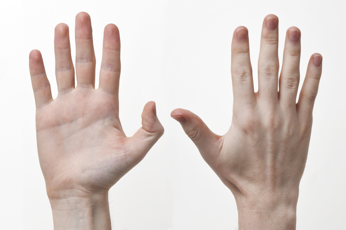
In user-centred design, a key concept is affordances. This is a concept from the work of Don Norman, who has written various classic, thought-provoking and highly readable books about design. An affordance is something that a design allows the user to do. That affordance may be intended by the designer, but often it’s unintended, and quite often it’s something very different from what the designer intended or wanted.
A classic example of an affordance is the size and shape of a smartphone. A typical smartphone offers the intended affordance of being a size that fits comfortably within a human palm. However, it also offers other affordances.

Image copyleft Hyde & Rugg; incorporating hand image from Wikimedia
So far, so good. Also, up till this point the concept of affordances is very similar to the traditional engineering concepts of specifications and requirements.
With user-centred design, however, the designer will also be thinking about unintended affordances, both desired and undesired, as an integral part of the design process. That’s different from the traditional engineering approach, which often in practice views undesired affordances as someone else’s problem (usually the user’s, and usually handled in this worldview via instructions manuals and disclaimers rather than via the design of the product).
How do you find out about unintended affordances? You can get a pretty good idea from showing mockups to prospective users and getting them to think aloud about their reactions to the mockup. You can get an even better idea by asking prospective users to think aloud about the mockup projectively, i.e. as if they were someone else, such as a mischievous teenager. I once heard a talk from someone who was working on a design for a hospital bed which could drive itself to a chosen destination selected on a built-in computer. The designer hadn’t given much thought to undesired affordances, but the audience soon spotted enough of them to provoke a continuous ripple of barely-suppressed giggles around the lecture theatre.
Affordances aren’t always about enabling users to do things, nor are they always a clear-cut case of “the user can do X” versus “the user can’t do X”. Sometimes, affordances nudge people. Here’s an example.
For most people, the Zen garden means something like this.

https://commons.wikimedia.org/wiki/File:Ryoanji_rock_garden_close_up.jpg
When you think in terms of positive and negative affordances and of nudges, you start to see a lot going on in this image.
For example, the rocks are surrounded by raked gravel. That has the inbuilt nudge of discouraging people from walking on the gravel, which would spoil the aesthetics. So, this garden doesn’t offer any affordances about walking or playing; it’s just a garden for looking at.
Similarly, it doesn’t offer many affordances for pets unless the garden owner is okay with the prospect of the garden becoming an animal toilet. That has another inbuilt nudge, towards keeping animals out of the garden.
There’s another inbuilt nudge about making it difficult for gardeners to water or weed the area around the rocks; this seriously reduces the affordances about which types of plants can grow there.
When you look at a more panoramic view of a classic raked gravel Zen garden, the implications hit home.

https://commons.wikimedia.org/wiki/File:Kyoto-Ryoan-Ji_MG_4512.jpg
The garden is in a courtyard with a high wall, that will keep animals out. The garden abuts against two sides of the courtyard, so there’s no destination on the other side that might tempt people to walk across the garden. The only plants are mosses, and those look short of water. These aren’t criticisms of gravel gardens; they’re an illustration of how a design can have inbuilt implications for affordances and for behavioural nudges.
Once you start thinking this way, it’s a lot easier to spot potential opportunities, as well as potential problems. This offers you the affordances of being able to make the most of the opportunities, and of designing out the problems, either partly or completely. For instance, if you were concerned about the problem of access to the green areas in a raked gravel garden, then one design solution would be to include some stepping stones in the garden so gardeners could get to the green areas without disturbing the gravel.
Layer 2: How easy is it to use?
When you know what the desired affordances of a design are, then you can measure how easy or difficult it is for people to use those affordances.
A classic way of measuring ease of use with regard to software is to count the number of mouse clicks and/or keystrokes that are needed in order to do a given task. Usually, user-centred software designers concentrate on making the most common and the most important tasks as easy as possible (i.e. they require an absolute minimum of clicks and keystrokes).
There are other ways of measuring ease of use. Some common measures are:
· Time taken to perform a given task
· Number of separate actions required to perform a task
· Number of times a user makes a mistake when performing a given task
· Number of times a user hesitates or goes to the help pages
· Number of times a user mutters or swears
· Number of times a user smiles or says something positive
· Scores on subjective rating scales (usually Likert-style scales)
Layer 3: How attractive is it?
The two layers above tend to produce designs which are minimalist and elegant. That isn’t an accident. Both layers focus on identifying just what the product is intended to do, and on finding design solutions that help the user to achieve those goals with the absolute minimum of mental or physical effort.
Because the human cognitive system has some tight limits in capacity and processing power, those design solutions tend to have features in common, such as a minimum of distracting physical and visual clutter, and a systematically structured layout. These features fit well with the aesthetic of minimalist design, as in classic Apple products. They also fit well with other types of design ethos, such as form following function, and often with green design.
As a closing example, I’ll return to the image at the start of this article. It’s of a water transport system, and it shows how a design which is good in terms of user-centred design can also be good in terms of the production process.
https://commons.wikimedia.org/wiki/File:Bambouseraie_de_Prafrance_20100904_110.jpg
The water runs along a length of split-open bamboo. When that length comes to an end, the water drops into another length of split-open bamboo. The image shows how that transition between lengths is handled. There’s an upright post, again of bamboo, with two holes drilled through it. Each length of split-open bamboo slots into one of those holes, and is held in place by a small peg, probably also of bamboo.
It’s an absolutely minimalist design, making brilliant use of the key features of a plentiful local material, and requiring minimal modification of the materials. It’s also subtly unique, since no two lengths of bamboo are completely identical. Followers of Zen or of the Arts and Crafts movement would approve. Fans of the baroque, however, might have different opinions…
Closing thoughts
The design approach that I’ve just described is very different from the view that the visual design is the last thing to be added. It’s an approach that can be applied to a wide range of fields, ranging from architecture to smartphones to Web pages. It usually comes as part of a methodological package that includes an overall design process (generally iterative, with mockups early on and prototypes later) plus techniques for capturing and clarifying user requirements, as well as techniques for evaluating usability and user opinions of the product. It’s an approach that’s particularly well suited to designing one-off products, such as a unique building, and to novel types of products, or novel designs for an existing type of product.
Returning to the ambivalent compliment about the Search Visualizer software at the start of this article, just in case you’re wondering: Yes, we did design Search Visualizer using the approach I’ve just described. And yes, we still use the same design approach. It’s clean, simple, and efficient, and once you learn it, you start to wonder why anyone would use any other approach.
We’ll be blogging about related design concepts, such as ego-free design, in future articles. I’ll also be returning soon to my regular series of articles about design and requirements, with an article about measurement and evaluation.
Notes
The hand in the schematic smartphone image is from Wikimedia:
https://upload.wikimedia.org/wikipedia/commons/3/32/Human-Hands-Front-Back.jpg
The Search Visualizer software is available free, online, here:
Our blog about Search Visualizer is here:
http://searchvisualizer.wordpress.com/
Don Norman’s books, on Amazon:

Pingback: Don Norman’s Plea for Design In Business @DMI Boston | Open Innovation Central
Pingback: One hundred Hyde & Rugg articles, and the Verifier framework | hyde and rugg
Pingback: Sociotechnical analysis, room layout, and education | hyde and rugg
Pingback: 150 posts and counting | hyde and rugg
Pingback: Signage, literacy and wayfinding, part 1 | hyde and rugg